Table of Contents
How It Works – Setting up a Membership Portal and Courses
How it Works – Creating the Forum

What is Kleq?

Many online entrepreneurs know the quandary of paying for 15 different tools to achieve their business aims, the challenge of learning to use them, and the frustration of software that just don’t “play nice” with each other.
Enter Kleq.com. John Lint‘s brainchild sprung from his own company’s business needs, and the ambitious notion, wouldn’t it be nice to have one easy-to-use tool that did everything? Kleq makes no idle boast – it really does do practically everything an online business could need.
Among the things you can do with Lint’s Swiss army knife of a product are:
Create your product and sell it online:
- Online courses built with drag n’ drop ease in professional-looking portals
- Membership sites created in minutes so you can start bringing in recurring income
- Live streaming pages letting you coach your audience and answer questions in real time
- Drip-fed content, perfect for automating your business or delivering your stuff to new customers
- Social walls – a private community right within your course
- Private coaching increases the value of your offer by letting you help people one-on-one
- Gamification to increase the retention of your courses by letting you reward your audience

You can enable gamification to encourage community engagement and increase retention.
Promote your offer, build an audience and bring in more sales:
- 1-Click install campaign technology lets you deploy tried and tested marketing templates in a click
- State of the art page builder creates and customizes optin pages, sales pages, content pages and much more
- Easy online payment acceptance, set up in minutes and integrating with any payment system you might use
- Any campaign you want – list building, product launches, quick sales, webinars, segmented offers – you name it!
- Any emailing, any payment system integration via webhook technology

One-click install campaigns to choose from
Activate systems that sell 24/7:
- Automated countdown timers, unique to each visitor and not needing extra plugins
- Automated product launch – entire evergreen campaigns set in motion with a click
- Automated webinars completely built in, no need for extra tools, scripts or systems
- Behavior tagging at any key point you desire – on purchase, on viewing your offer – whenever!
- Dynamic redirects send your users to specific pages based on their tagged behavior

You can use dynamic redirects in your emails, to send people to a page or redirect them to a different page based on autoresponder tags.
Boost your leads and sales with advanced conversion optimizers:
- Email countdown timers, built in to create urgency and get your users clicking
- Audience segmentation to make sure you deliver the right message to the right people
- Viral share campaigns quickly deployed to boost your leads dramatically
- Optin boxes – build your list faster by placing optins wherever you want
- 1-Click sign up links for more signups, more registrations and easy segmentation
- Social notifications with the check of a box, to leverage social proof
- Affiliate system to bring in that best kind of traffic – the referred kind

You can create pop up optin boxes

You can also create optin boxes directly on your page!
Who is Kleq for?
Consider Kleq.com if:
- You’ve had it with spending large sums on programmers and developers.
- You’re done paying for numerous tools and plugins.
- You don’t want to spend any more time figuring out how things work.
- You’ve had enough of tech-related headaches.
How It Works – Setting up a Membership Portal and Courses
One of the things that Kleq makes easy is the creation of attractive, user-friendly membership portals like the following:


You start by logging into your Kleq account, go to Online Courses (below Members Area) and click on the 3 dots at the top-right, and click on Settings. This will open up the Portal Settings window, where you need to customize the features of your portal.

Set up the basics of your membership in Portal Settings
And save your changes.
Next, customize the look of your membership dashboard for Desktop users by clicking on the 3 dots at the top-right, and clicking on Home Page.

Proceed to creating your courses.
Click on the plus sign at the top-right.

Customize your course settings and save. You can start with just the course name and image.
Then add your content.

Simply click Add New Page…
Name the page and choose the type of page you want to add, whether:
- Regular course page
- Live event course page
- Social wall page, or
- Private chat page
… and click Add.

Then click Edit to edit the page.

On the page editing space, you’ll find all you need to customize your course to your heart’s content.
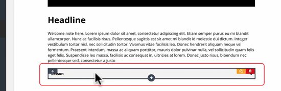
To add an element, simply click on the (+) that appears when you hover over a block.

A menu to add any element you choose will appear at the left.

Adding an image? A block will appear for the picture, with customization options at the left.

Adding a video?
You can use self-hosted media or embed codes from Wistia, Vimeo or YouTube, any platform you choose.

Kleq’s easy-to-use system lets you add as many lessons as you want to your course.
A look at a finished course:
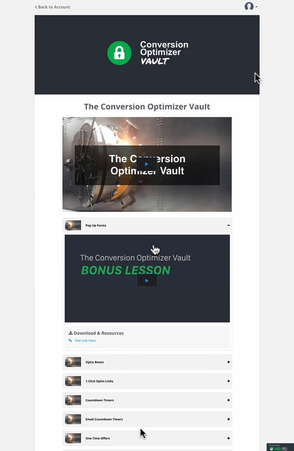
And that is just a glimpse of what can be done with Kleq.
Ready to try out Kleq? Click HERE
How it Works – Creating the Forum
Just recently added to Kleq’s repertoire is the forums feature, letting you create an attractive forum for your online community.
Start by clicking Forum (below Members Area) and click on the 3 dots at the top-right. Fill in the required items and save.

Then create your forum’s basic structure by clicking on the + sign at the top-right, and entering a category name. The forum has a tree-like directory structure and category is at the top level. You can move finished categories around by dragging them, and you can edit or delete them.
You can then create sections, which will appear below your category.

Forum is the category, General and Progress Journal are the sections.
The forum live
A look in your membership portal will show your forum among your courses, but separate from it. Click on View to enter the forum.

This will take you to the forum home page. There you can see the forum categories and sections…

and threads.

Further customizing the forum homepage
You can open the forum homepage editor by going to Forum, clicking on the 3 dots at the top-right, and clicking on Forum Home Page.

You can easily customize elements in blocks. As with the course editor, a click on the (+) sign opens up a panel to the left where you can select any element you would like to add to the page.
Adding threads in the forum live view
To add threads under your sections, navigate to your chosen category and click on the New Thread icon…

…give a name and description, add videos/links/images, and save.

The thread will appear in the section as so:

Under the section “Forum and Support”, the latest thread “Demo Thread” appears on top of the rest, unless you have a pinned thread, like in this example:

And on the homepage, the latest thread appears as below:

An App for your website
For a small monthly extra fee, Kleq users can get an app for their Kleq membership / online courses site. The app is a convenient way for you and your members to access courses, participate in forum discussions, answer and send direct messages.
The app works on Android and iOS, and requires very little input from you to set up. You just need to upload 2 logos, and specify a code for your membership site! Then Kleq will do the rest for you!
For your users, all you need to do is give them the download link for the app, give them their user name and password (they receive this upon registering for your course / membership) and your membership site code!

This is currently what our app looks like on iOS
All your style
Kleq offers pre-built templates for ease of use, however everything is customizable to match your brand and style.
- Customize whatever you want
- Your brand and domain name
- Your audience and email list
- Your own business and revenue (no transaction fees)
- And much more!
Help when you need it
With a dedicated help team on standby, you never have to worry about getting stuck.
- Priority concierge support
- Deep Knowledge Base articles
- Live Chat support for ALL Kleq members
- When you really can’t do it yourself, the team can even do it for you!
Other notable features:
- You can easily set up a blog, with templates you can customize for the blog page, blog post, and category page.
- You can integrate your site with Stripe, Paypal, S3 for hosting, Zapier or other service that provides webhooks, and autoresponders such as but not limited to Ontraport, AWeber, and Infusionsoft
- Kleq Analytics allows to you set up tracking links and analyze important metrics such as product performance, funnel tracking, and more
- All hosting and speeding of the site is handled by Kleq
- Kleq Academy is where you can get deep dive training on everything Kleq, and that’s also the resource for your team to learn how to use Kleq
John Lint and his team are continually developing and updating Kleq to meet more of their users’ needs and wants. As of February 7, 2023 here are the newest developments to the software:
- Option to add shadow to Buttons, Images, rows and other blocks
- Admin can view affiliate link url of affiliates from manage affiliates section
- Option to hide navigation bar from course pages
- When duplicating a course it now displays below the selected course
- Drag n Drop downloads items on Download block
- Email notifications include details about missed notifications and link to destination
- In Billing modal, member can cancel a subscription themselves but not a payment plan
- Option for a member to MUTE a forum thread. No notifications will be received
- New forum section added for MUTED threads.
- APP – On Messages and chats if last message is from you it starts with “you:”
- APP – Entire forum post titles display and wrap to next line
- APP – support for MUTE of forum thread
- APP – Android – Universal link support
- APP – Android – Share link support
- APP – iOS & Android – Notification tap lands user to Specific app screen support
Thoughts from Kleq users:
“I love how simple this is to use and the team is awesome. After years of struggling with a bunch of different tools I can finally just focus on what I need to do without getting bogged down with tech. It’s what I’ve been looking for years!” – Jeremy Weiss
“I’ve tested a lot platforms over the years but Kleq.com is the ONLY ONE that allows me to finally just focus on generating leads and sales without getting bogged down trying to stitch together multiple systems.” – Jason Rogan
“LOVE LOVE LOVE what the team has done with Kleq.com. I have quickly & easily set up multiple automated campaigns. We now have multiple courses on sale and everything is running on autopilot. Simply Amazing! “ – Robin Nolan
More Kleq.com users speak:
Kleq is currently available on a 30-day trial basis. Get your private invite now and secure a lifetime discount.

Kleq founder John Lint with James Schramko
Ready to test drive the only online business tool you need? Click HERE.
")


Leave a Reply